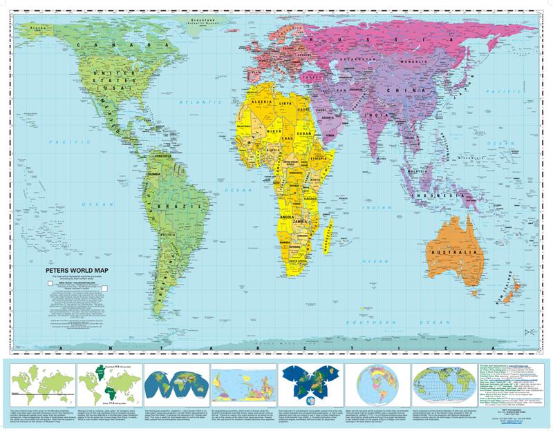
Africa is around 14 times larger than Greenland and yet on the map both are almost same size.
Brazil is more than five times larger than Alaska, yet Alaska is larger than Brazil on the map.
The map suggests that Scandinavian countries are larger than India, whereas in reality India is three times the size of all Scandinavian countries put together.
While it looks like Europe is larger than North America on this map, in reality the reverse is true. Russia also isn't as large as it is depicted, with Africa larger than Russia in reality.
Read more: http://www.dailymail.co.uk/sciencetech/article-2596783/Why-world-map-youre-looking-WRONG-Africa-China-Mexico-distorted-despite-access-accurate-satellite-data.html#ixzz3Eko3x0Xk
Follow us: @MailOnline on Twitter | DailyMail on Facebook
- The distortion is the result of the Mercator map which was created in 1596 to help sailors navigate the world
- It gives the right shapes of countries but at the cost of distorting sizes in favor of the wealthy lands to the north
- For instance, north America looks larger, or at least as big, as Africa, and Greenland also looks of comparable size
- In reality, you can fit north America into Africa and still have space for India, Argentina, Tunisia and some left over
- Map suggests Scandinavian countries are larger than India, whereas in reality India is three times the size
- The biggest challenge for cartographers is that it is impossible to portray reality of spherical world on a flat map
Take a look at a map today, and you’re likely to see that North America is larger than Africa, Alaska is larger than Mexico and China is smaller than Greenland.
But in reality China is four times bigger than Greenland, Africa is three times bigger than North America and Mexico is larger than Alaska.
The distortion is the result of the Mercator projection, the map most commonly seen hanging in classrooms and in text books, which was created in 1596 to help sailors navigate the world.


 RSS Feed